Logo Design and Web Design
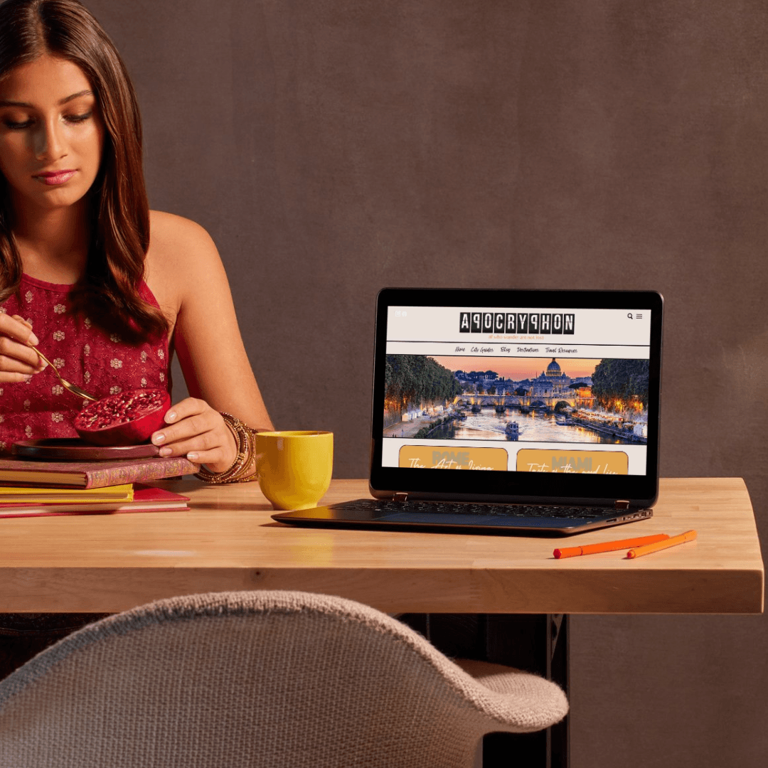
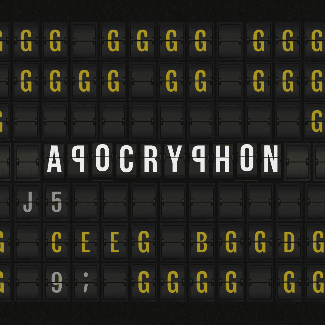
Apocryphon
4 weeks
Introduction:
For this project, we were tasked with developing a logo and website for a client launching a travel blog aimed at millennial solo travelers seeking advice and guidance for their journeys. The blog's unique target audience called for a design that was bold, engaging, and reflective of the thrill of travel without relying on traditional imagery or color.
Challenges and Solutions:
One of the major challenges in this project was the client’s request to avoid a brand mark, while still needing the design to communicate a sense of travel. Additionally, the entire branding had to be created in black and white, adding a level of complexity in creating something visually dynamic with a restricted palette.
To solve this, we took inspiration from the iconic split-flap displays found in airports and train stations worldwide, replicating that mechanical style in the typography of the logo. This approach allowed the logo to convey movement and travel while remaining sleek and minimalist in black and white. The final design captured the spirit of exploration without needing to rely on conventional icons like planes or luggage.
Design Approach:
The creative process began with hand-drawn sketches to map out the split-flap letterforms and visualize how the design would unfold. We then moved into digital work, using Procreate for initial digital sketches and refining the logo in Adobe Illustrator to perfect the typography and alignment.
Client Impact:
The client was thrilled with the final logo, and our collaboration expanded to include merchandise design and business cards. The success of the brand’s initial design helped the blog evolve into one of the leading travel sites, now boasting over 500,000 visitors per month. Even though the blog has since rebranded, the original design played a key role in its growth and recognition.
Personal Impact:
This project also had a personal influence on our team. During the discovery phase, we traveled to several destinations, including Miami, Denver, and Beijing, to gain more insight into the travel lifestyle. This experience not only informed the project but also inspired the creation of Fifteen50 Designs, marking a pivotal moment in our journey as a design studio.

Conclusion:
This project challenged us to think creatively within tight constraints while still delivering a solution that embodied the excitement of travel. The split-flap logo became a perfect representation of the blog’s focus on solo journeys and adventure, and its success was a milestone in both the client’s and our own creative journey.